
Creator research · 6 min read
How to Make YouTube Thumbnails People Actually Click
By PimpMyViews Team ·
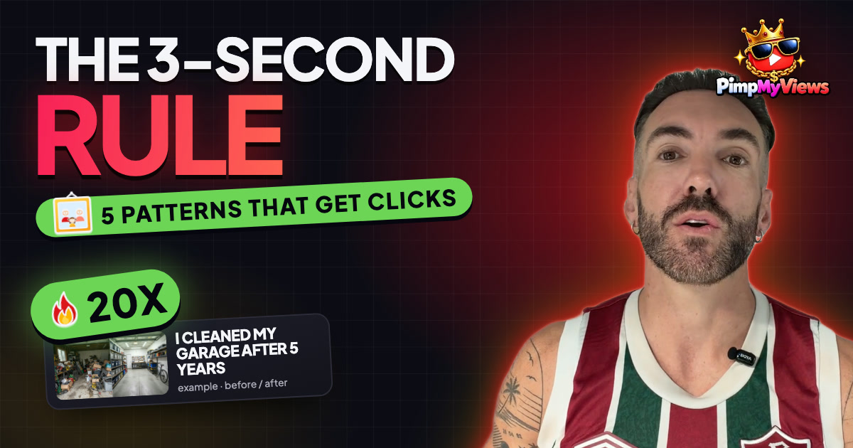
Picture your phone. You open YouTube and the home page shows you a wall of videos. You don't read a single title yet. Your eyes land on one picture and your thumb stops.
That picture is the thumbnail, and it decides whether anyone ever hears a word of your video. Here's how to make YouTube thumbnails people actually click, with no design skills: one rule, five patterns and the habit of taking things out.
Last time we wrote titles by stealing the pattern from outliers. Today we do the same thing for thumbnails.
Why your thumbnail matters so much
Every time YouTube shows your video, it's running a little test. If people click and keep watching, it shows it to more people. If they scroll past, it slows down.
The share who click is your click-through rate (in YouTube Studio). There's no magic number, since it changes by niche and by where the video is shown, so compare your videos to each other, not to someone else's. If one gets clicked a lot more than the rest, its thumbnail is telling you something.
And here's the bit most people miss: the thumbnail and the title are a team. The thumbnail grabs the eye. The title explains why you should care. So the thumbnail shouldn't repeat the title. It should add something the title can't: a face, a feeling, a result you can see.
How to make YouTube thumbnails pass the 3-second rule
Someone should understand your thumbnail in under three seconds, on a phone, while scrolling. On a phone it's tiny, often smaller than a business card. So every thumbnail needs three things, and not much more:
- One main thing to look at. A face, an object, a result.
- Strong contrast, so it doesn't melt into the page. Bright against dark, or dark against bright.
- Three or four words at most (if you use words at all), big enough to read on a phone.
The test: shrink it right down, or step back from your screen. If you can still tell what it's about, it works. And keep the bottom-right corner clear: YouTube puts the video's length there.
The 5 thumbnail patterns outlier videos use
Just like titles, outlier thumbnails keep using the same few patterns. Look at videos that did 10 or 20 times their channel's normal views (here's what an outlier video is) and these five come up again and again.
- The face with a feeling. A real person, close up, with a clear emotion: surprised, worried, excited, confused. The emotion tells you what kind of video it is before you read anything. The key word is *real*. You don't need a cartoon scream. You need a face that matches the story.
- Before and after. The screen split in two: the messy room and the clean room, the old car and the restored one, the empty channel and the full one. Your brain instantly wants to know how you got from one side to the other.
- The one big object. Just one thing filling the frame on a plain background: a single tool, a single meal, a single bank card. When everything else in the feed is busy, one clean object stands out.
- The number or result. A big, bold number that shows the payoff: 30 days, $10,000, zero to 1K. The number should match the promise in the video, and it should be true.
- The mystery. Something circled, an arrow pointing at something, or part of the picture hidden. It asks a question, and the only way to answer it is to click. Just make sure the video actually shows what you circled. Otherwise people feel tricked and leave, which hurts more than a boring thumbnail would.
How to steal a thumbnail design without copying it
Three steps, and they work exactly like the title method.
- Find the outliers in your niche. Put a few channels into [PimpMyViews](https://pimpmyviews.com), sort by outlier score and save the thumbnails of the videos that did 10 times or more.
- Put them side by side and look for what they have in common. Ask four questions: What's the main thing? Where is it placed? What are the colours? How many words are there? Often most outliers in one niche share a style: all close-up faces on bright backgrounds, say, or all before and after.
- Keep the structure, change everything else. Your face, your topic, your photo, your colours. The layout is the pattern; the content is yours.
What you never take is someone else's actual image, their face or their exact design. That's not research, that's copying, and viewers notice.
A thumbnail makeover, step by step
Say you made a video about fixing a slow laptop. Most people would use a dark photo of a laptop on a desk, with "How to speed up your laptop" in small white letters.
On a phone it's a grey rectangle with tiny writing. Let's fix it, one change at a time:
- One main thing. Instead of the whole desk, go close on the laptop screen so it fills the frame.
- Show the result. Make it a before and after: on the left, a loading wheel and "4 MIN"; on the right, the desktop ready to go and "10 SEC". Now the payoff is visible.
- Cut the words. The title already says it. Just the two times, big and bold.
- Add contrast. Make the slow side dull and red and the fast side bright and green. If you're comfortable on camera, add your face in the corner, looking at the fast side, surprised.
Now shrink it down. You can still see slow, fast and a big difference: it passes the 3-second rule. No design skills needed. We removed things, made the main thing bigger and showed the result. Most good thumbnails are made by taking things out, not adding more.
5 checks before you upload
- Does it pass the 3-second rule when it's tiny?
- Does it add something new, or does it just repeat the title?
- Is there one clear main thing, or are three things fighting for attention?
- Does it stand out next to the other thumbnails in your niche? If everyone uses red and yellow, maybe yours should be blue.
- Does the video deliver what the thumbnail shows? If your thumbnail shows a result, show that result early in the video.
Technical basics: 16:9, 1280 × 720 pixels, and check it in dark and light mode.
Make three versions, not one
You don't have to get it right first time: you can change a thumbnail after you publish. Many channels now have Test & Compare in YouTube Studio: upload up to three thumbnails and YouTube tells you which one people watch the most. No access yet? If a video is stuck after a few days, swap in your second-best thumbnail. It costs nothing. So make two or three versions for every video, just like the 10 titles.
Your homework
Find five outliers in your niche and save their thumbnails. Write down each one's pattern. Then make three thumbnails for your next video using at least two patterns, and shrink them to see which still works.
Frequently asked questions
How do you make a YouTube thumbnail people click?
Give it one main thing to look at, strong contrast and three or four words at most, so it makes sense in under three seconds on a phone. Then borrow the pattern from outlier thumbnails in your niche and make two or three versions.
What are the best YouTube thumbnail patterns?
Five patterns keep showing up on outliers: a face with a clear feeling, before and after, one big object, a number or result, and a mystery (something circled or hidden).
What size should a YouTube thumbnail be?
16:9, 1280 × 720 pixels. Check it in both dark and light mode, and keep the bottom-right corner clear because YouTube puts the video length there.
Can I change a YouTube thumbnail after publishing?
Yes. Many channels can use Test & Compare in YouTube Studio to test up to three thumbnails. Without it, swap in your second-best thumbnail if a video is stuck after a few days.
Get The Outlier Report
Each week, the biggest breakout videos across popular niches — straight to your inbox. Free.